
Yoko
Packaging design & Branding
2022
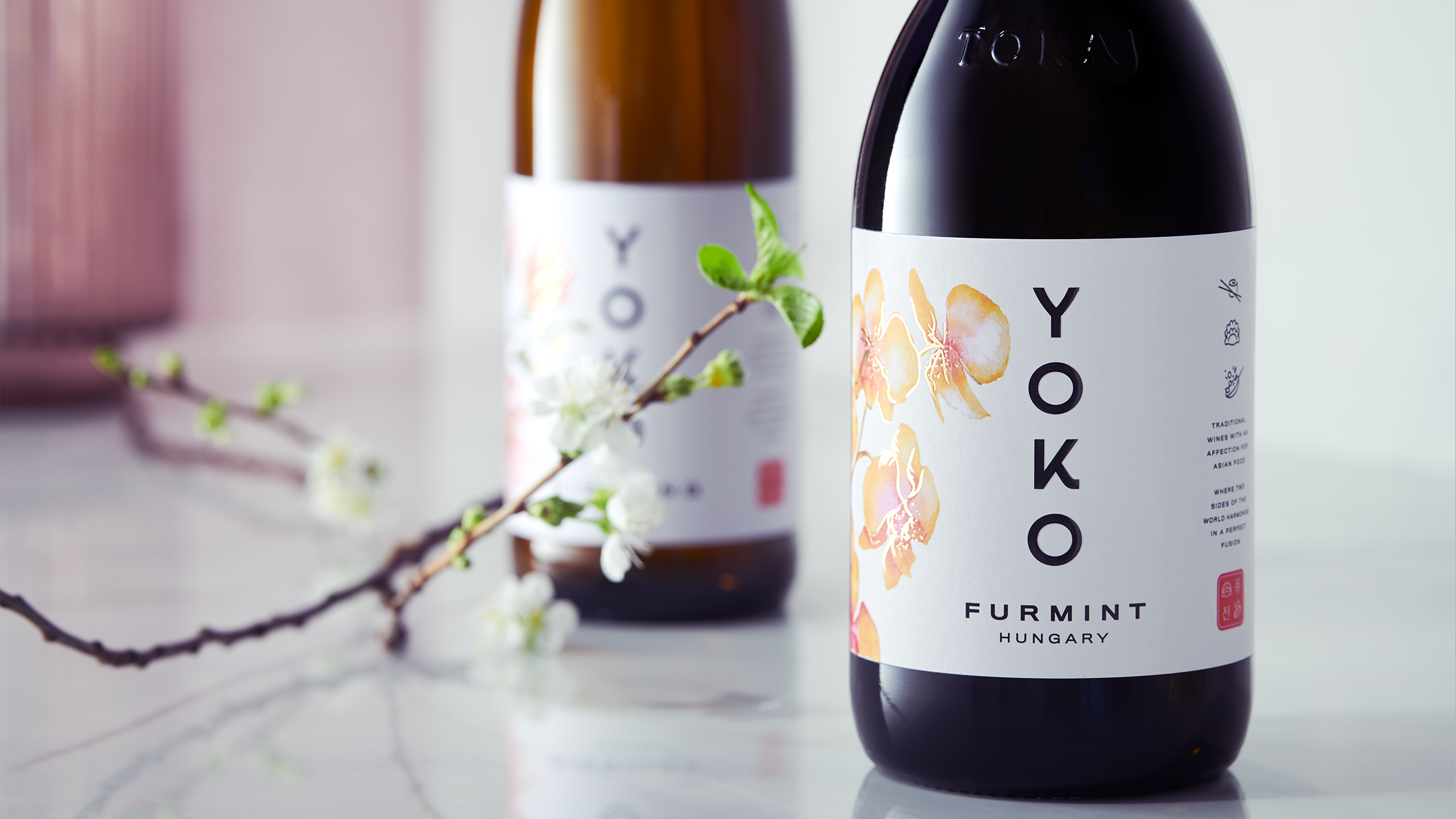
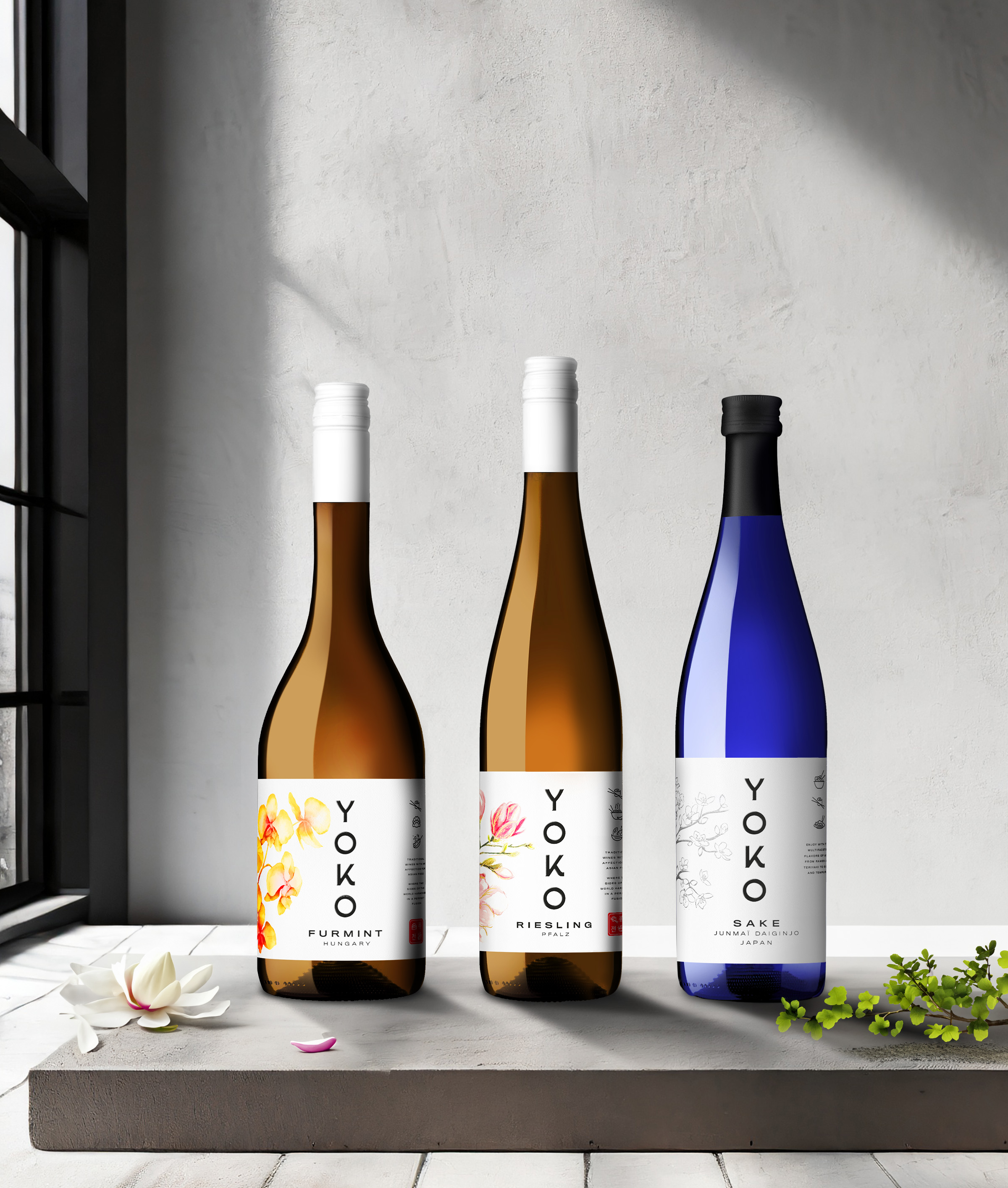
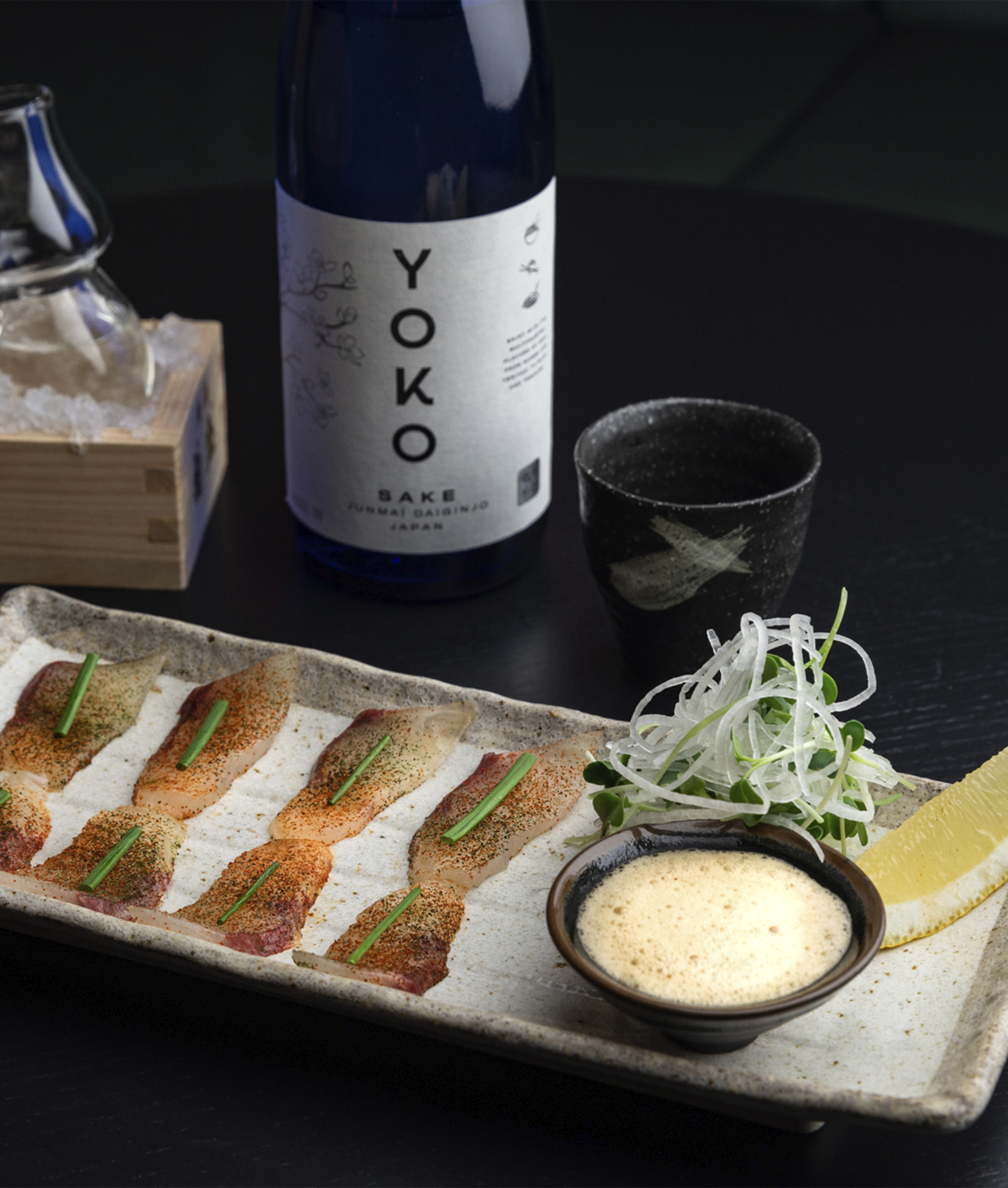
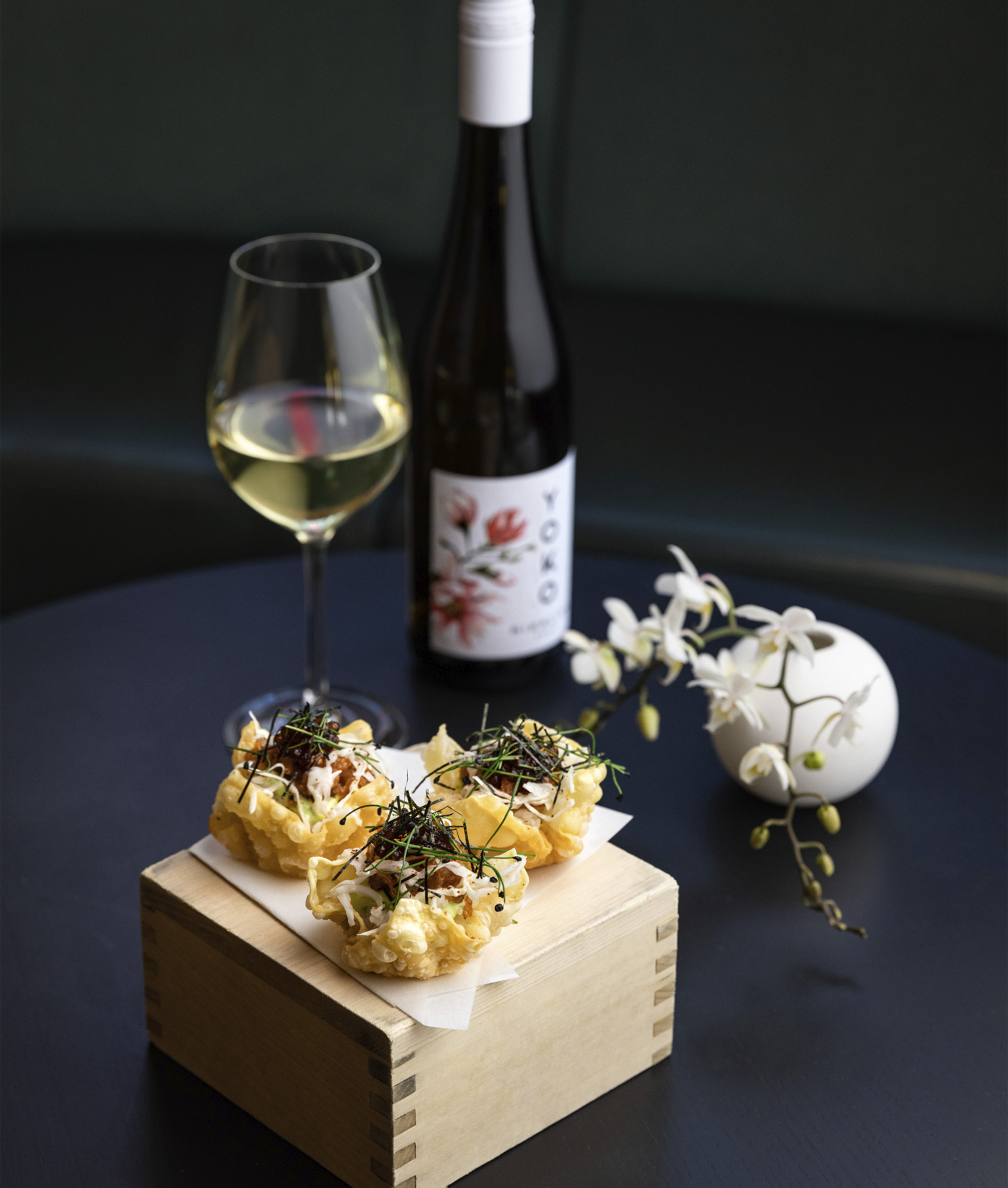
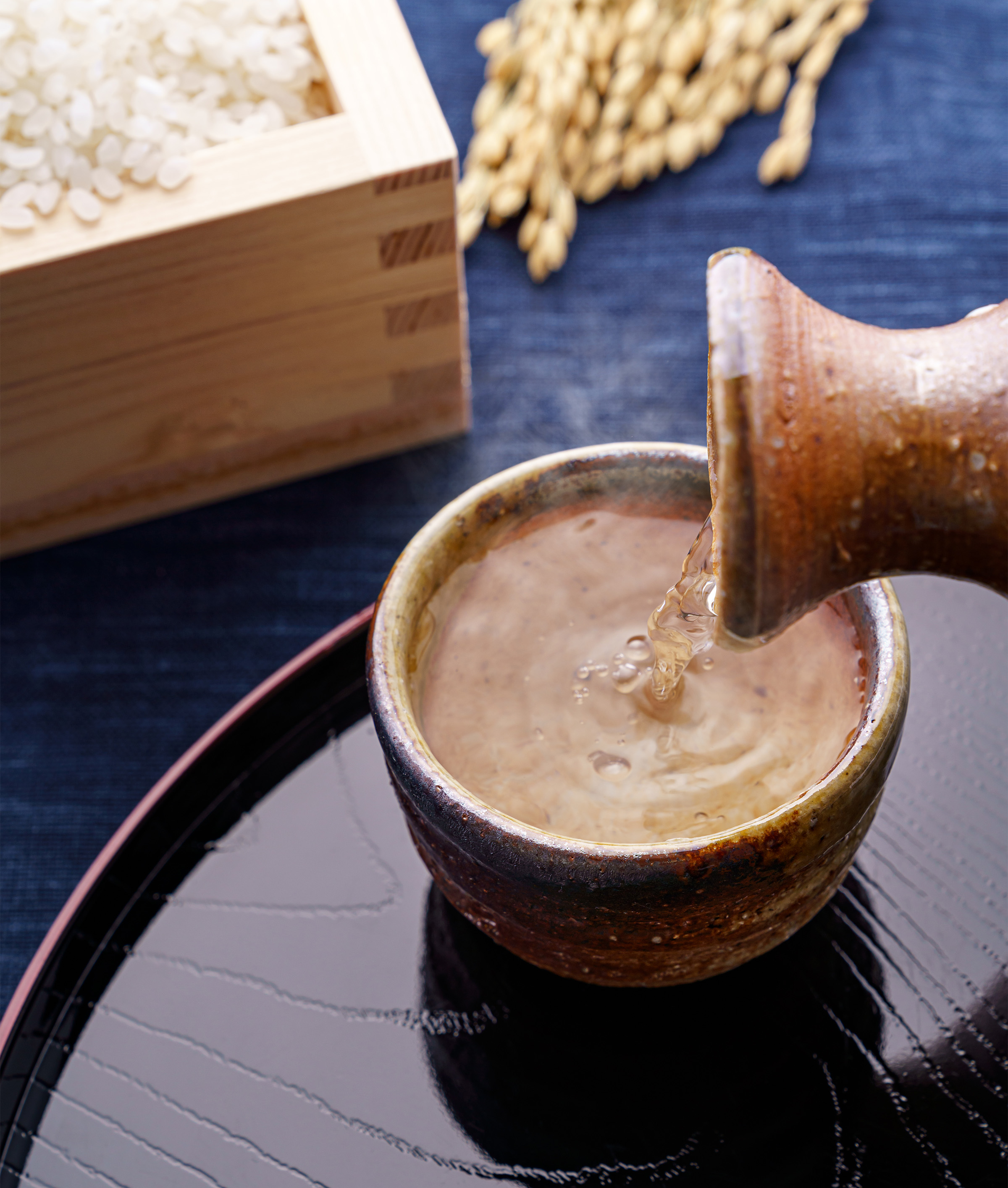
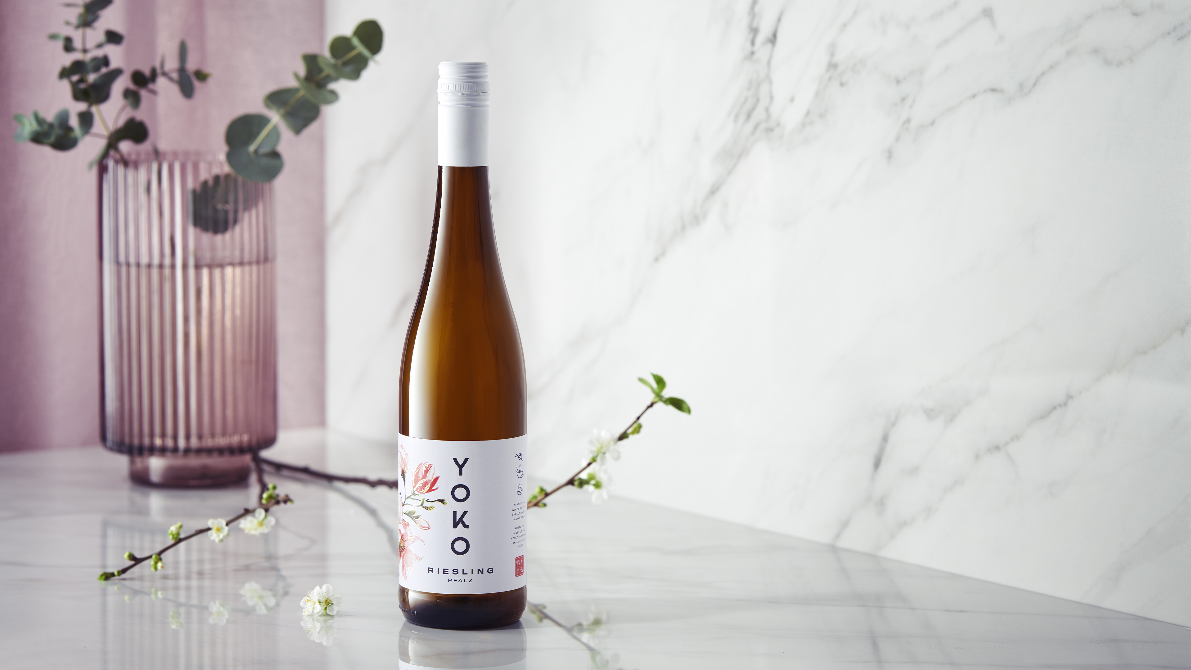
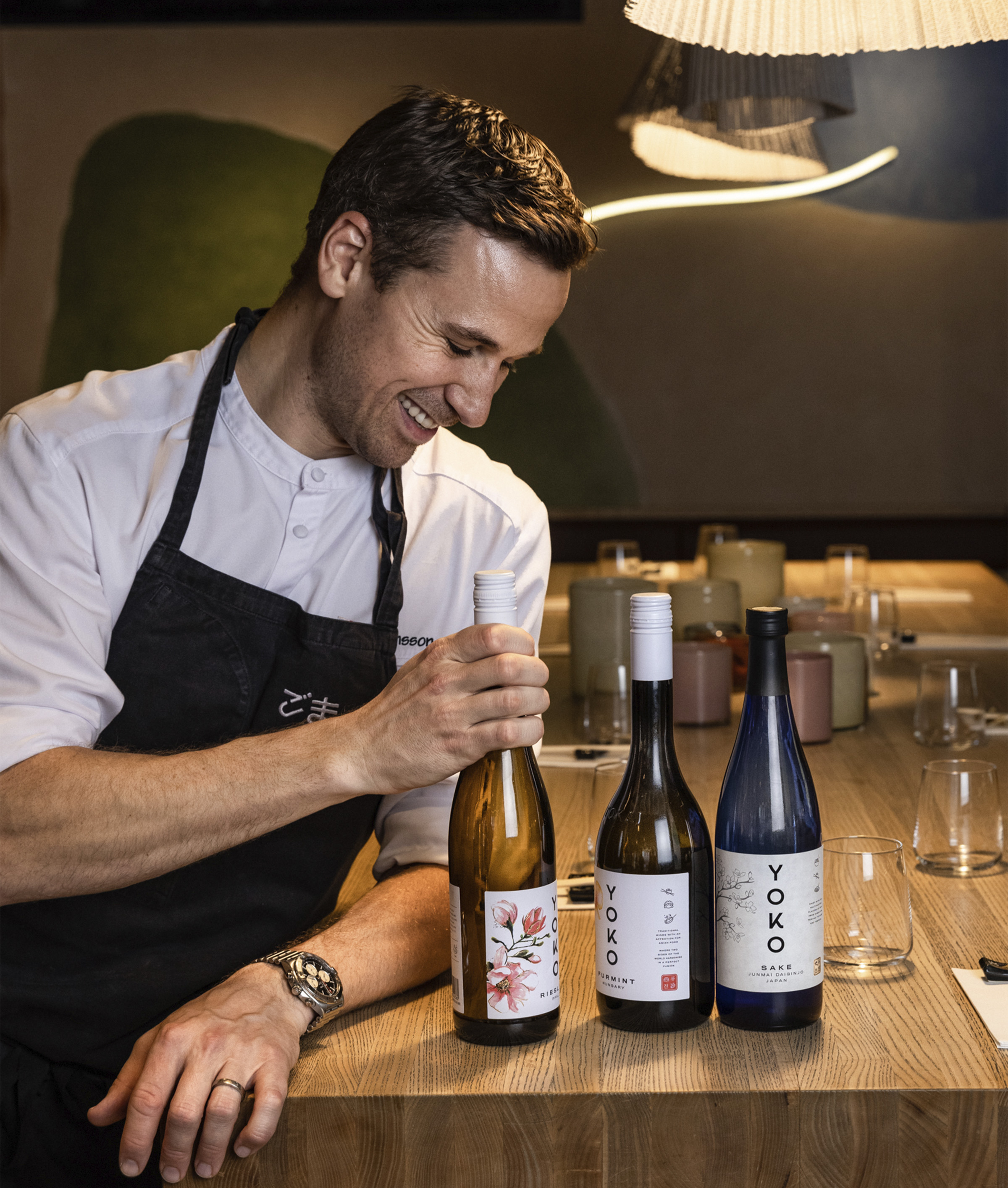
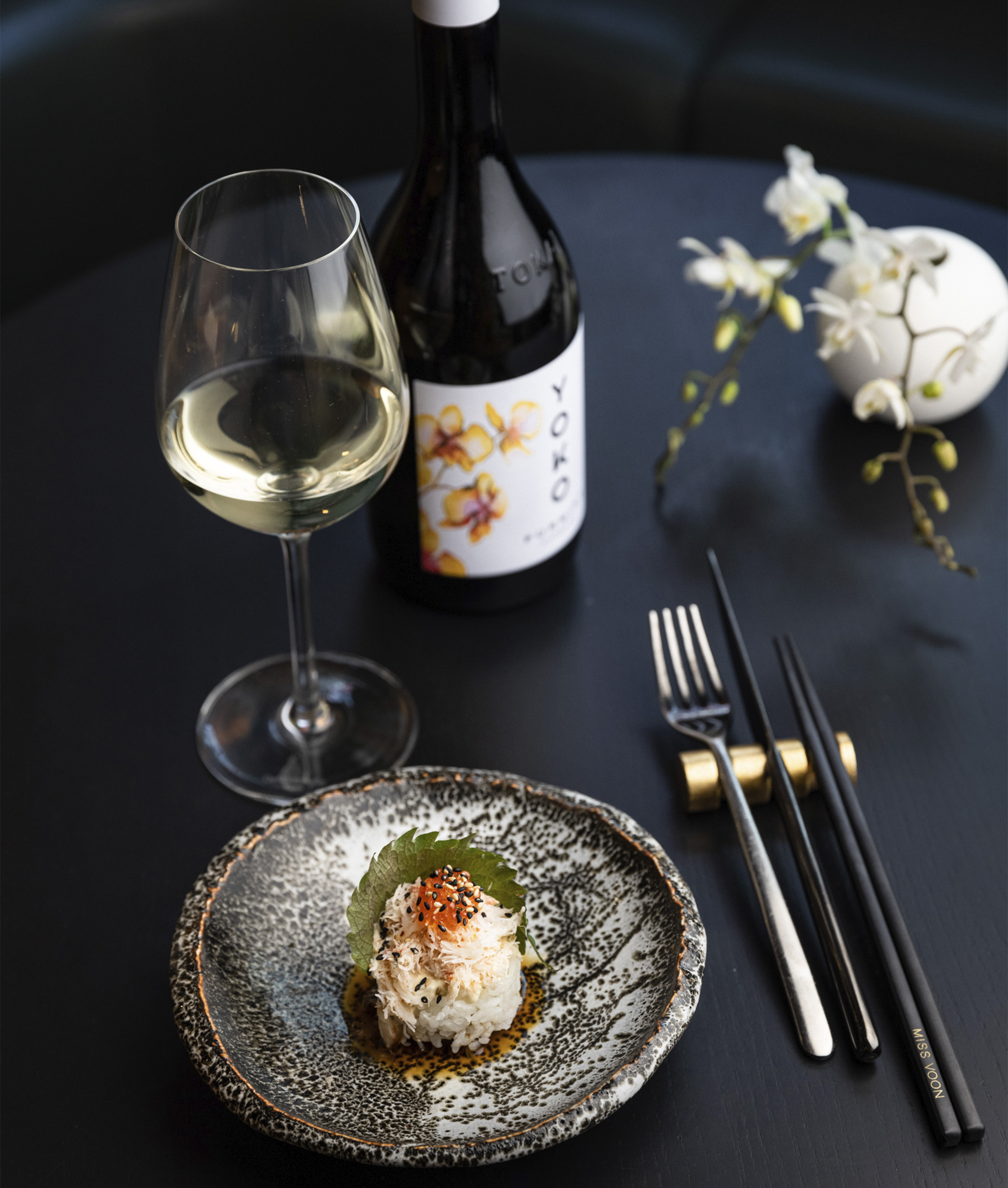
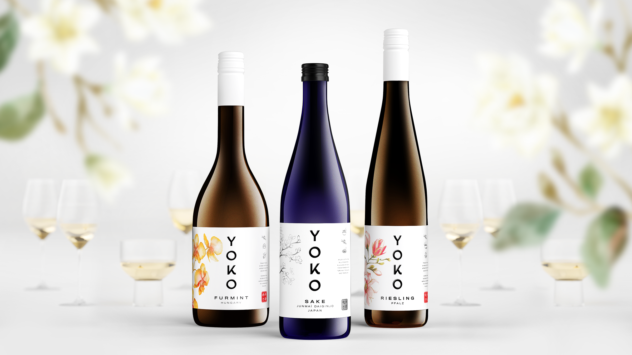
Beyond packaging design! Here’s a prime example of when we not only provided the customer with a stylish exterior but also invented an easy-to-remember name with an Asian vibe. The aim was to show Japanese aesthetics and elegance that could be combined with European wines. Our client, Anora, also wanted to make it easy for the consumer to choose wine for different Asian dishes. Each bottle is therefore adorned with icons that illustrate which food is best matched with each wine. With strong influences from traditional Japanese art, we further composed the labels with a lot of white space, Asian vegetation such as cherry blossoms and orchids, with the icons stacked to the side. Clean and harmonious, it’s an aesthetic that is beautiful in its simplicity.
Client: Anora
Photo: NewFun, Maria Cruesman & Goldstorm
Packaging design & Branding
2022
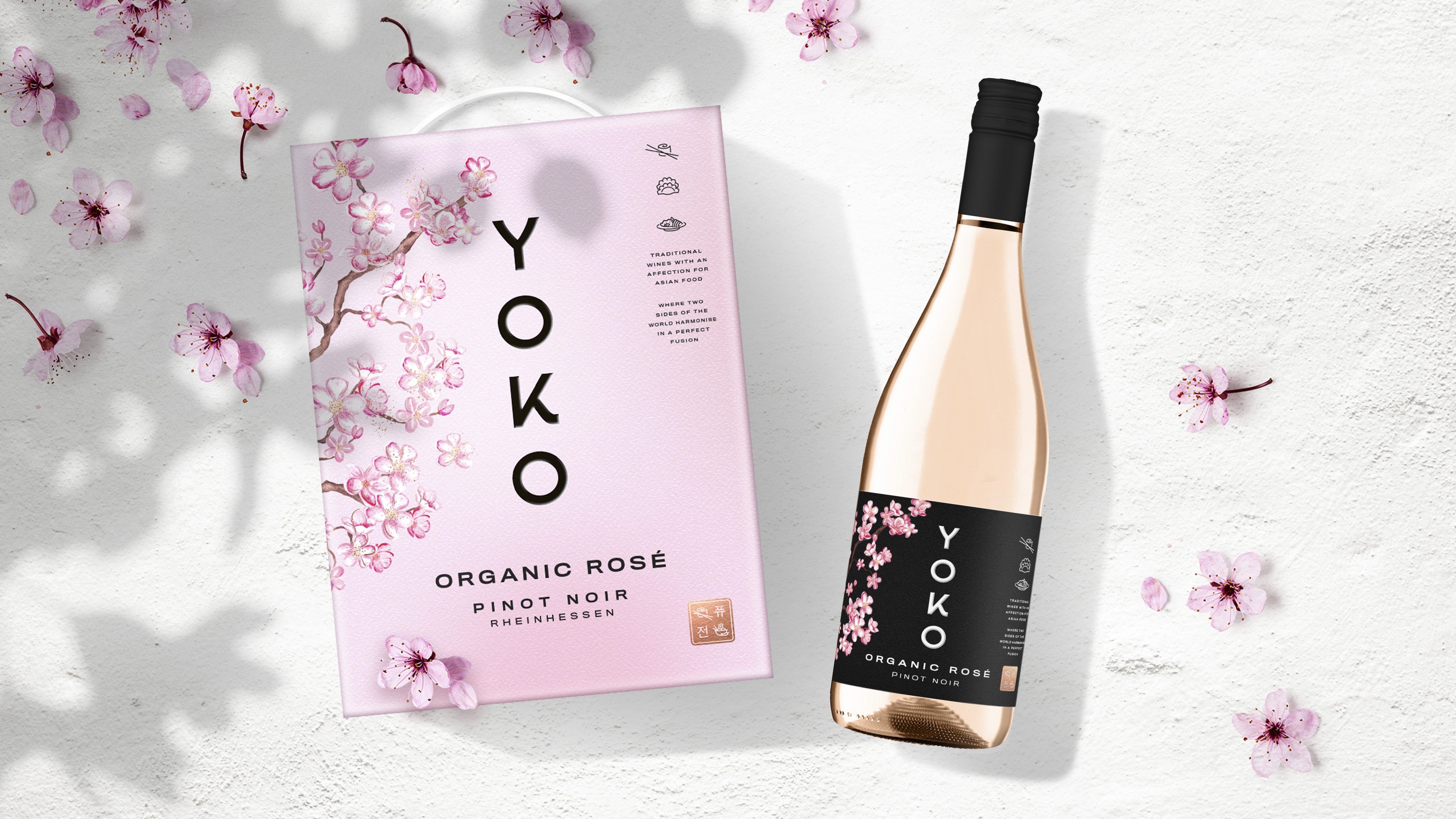
Beyond packaging design! Here’s a prime example of when we not only provided the customer with a stylish exterior but also invented an easy-to-remember name with an Asian vibe. The aim was to show Japanese aesthetics and elegance that could be combined with European wines. Our client, Anora, also wanted to make it easy for the consumer to choose wine for different Asian dishes. Each bottle is therefore adorned with icons that illustrate which food is best matched with each wine. With strong influences from traditional Japanese art, we further composed the labels with a lot of white space, Asian vegetation such as cherry blossoms and orchids, with the icons stacked to the side. Clean and harmonious, it’s an aesthetic that is beautiful in its simplicity.
Client: Anora
Photo: NewFun, Maria Cruesman & Goldstorm


Let’s create a beautiful storm together.
Start by saying “Hey!”
hey@goldstorm.se | +46 (0)703 059 718